Update on Covid providing information on prevalence and hospital admissions for England and its regions. This post is best viewed using the browser or Substack app.

bhawkins3.substack.com
Covid Situation Report: Aug 29, 2024
Update on Covid providing information on prevalence and hospital admissions for England and its regions. This post is best viewed using the browser or Substack app.
 BOB HAWKINS
AUG 29, 2024
22
4
Share
Introduction.
This report is part of a weekly series that summarises the Covid situation in England and its regions.
A reminder that not all of the data previously included in the situation update is now available on a weekly basis. Where relevant, changes to the content and data sources have been noted.
This week's report contains data on weekly Covid hospital admissions from the UKHSA surveillance report, which is now released biweekly. Additionally, it includes case rates from the UKHSA Covid dashboard and the latest available data for Scotland, Wales and Northern Ireland. Finally, there is a summary of a recent report on regional inequalities in Long Covid prevalence.
Summary.
Once again, the latest data for England, Scotland, Wales, and Northern Ireland show a continuing decline in Covid levels, indicating the end of the latest wave.
Over the past week, the test positivity rate in England has continued to fall, signalling that the summer wave is over. Hospital admission rates have also continued to fall.
In addition, case rates in England have continued to fall across all regions.
In Scotland, hospital admissions and the number of beds occupied by Covid patients have also continued to fall and are now well below the summer peak.
Wales has seen a continued and significant decrease in Covid cases and hospital admissions, indicating the end of the recent wave.
Northern Ireland is experiencing a similar trend, with hospital admissions for community-acquired Covid falling from the latest peak although levels have plateaued over the past few weeks.
Although the data indicates that this recent wave is over, this is an important reminder that Covid is not presently a seasonal disease and may never become one. As such, we should anticipate potential future waves with the emergence of new variants and as immunity levels diminish.
With that in mind, the UK Health Security Agency has released the
eligibility details for the Autumn 2024 booster campaign, which largely follows the criteria of previous autumn campaigns.
As always, it’s important to remember that the risk of hospitalisation from Covid infection increases significantly with age and for those immunocompromised. Also Long Covid remains a risk for all as shown by the recent
ONS report. Therefore, it is prudent to take appropriate measures such as self-isolating when experiencing Covid symptoms and enhancing ventilation or wearing masks whenever possible.
For those who are interested, I recently published an article covering the ONS data on Long Covid in more detail which can be found
here. Also a comprehensive review of the evidence in support of wearing masks is available
here.
Status of main respiratory diseases in England.
This section starts with the latest available data on positivity rates for primary respiratory infections in England. It is important to understand that positivity differs from prevalence, which refers to the overall percentage of COVID-19 in the general population. Appendix 1 provides a more detailed explanation of the difference and why positivity rates are a useful indicator of trends in Covid infection levels.
The chart below displays the test positivity rates for the main respiratory illnesses in England, including Flu, Covid, RSV, and Rhinovirus.
Over the past two weeks, the Covid positivity rate has fallen to 6.7% for week ending Aug 25 indicating that Covid levels in the general population are falling. Meanwhile, the flu positivity rate remains significantly lower than that of Covid. Additionally, RSV rates have dropped to very low levels, accompanied by a fall in Rhinovirus rates.
The next chart shows the trend for Covid positivity rate by age. Hover your cursor over one of the chart lines to display the positivity rate for all ages. For comparison the grey line shows the positivity rate for all age groups.
The test positivity rate has continued to fall across all age groups except for those between 15 to 44 years old which saw a slight increase in the past week. Positivity rates continue to be highest among those aged 65 and older, but it's important to note that most tests are currently performed on hospital patients, who tend to be older as they are more susceptible to hospitalisation due to Covid.
The final chart in this section shows weekly hospital admissions per 100,000 people in England for the main respiratory diseases.
Consistent with the test positivity rate data, the past two weeks have seen weekly hospital admission rates for Covid fall indicating that the summer wave of infections is over. Note that hospital admission data for Flu and RSV is no longer published.
Although age-specific data for hospital admissions are no longer released, earlier statistics on Covid hospital admissions and the current test positivity rates by age indicate that the rise in hospitalizations will primarily impact the over 65 year olds.
It's important to note that while testing policies have been updated from April 1, 2024, the guidelines for testing patients showing Covid symptoms or when a positive result would change the patient's treatment remained unchanged. Consequently, the number of Covid hospital admissions should be a dependable indicator of the virus's prevalence in the community for the period shown in these charts.
Covid case rates in England
The UKHSA Covid dashboard continues to publish daily case rates for England on a weekly basis. As the majority of testing now occurs in hospitals or under medical supervision, these rates should closely align with hospital admissions. However, a comparison of daily case rates and daily admissions shows that this is not the case.
Appendix 1 indicates that although Covid case rates typically reflect the pattern of hospital admissions, there is a notable discrepancy in the magnitude of changes, with admissions experiencing a more pronounced fluctuation than case rates. Therefore, while case rates are helpful in signalling the general trend of Covid within the population, they do not precisely represent the degree of change.
The first chart in this section shows daily case rate per 100,000 individuals.
The chart indicates that Covid case rates have peaked and fallen for the past seven weeks indicating that the ‘summer’ wave is over. Current case rates are now lowers than those observed during the peak in May. It is important to note, as detailed above and in Appendix 1, that comparisons with the peak in Winter 2023 are not recommended.
The next panel chart in this section shows Covid rates for the regions of England. Hover your cursor over one of the chart lines to display the admission rates for all regions.
The panel charts indicate a consistent decrease in daily case rates across all regions. The North East region, once the area with the highest Covid rate, has seen a substantial drop and is now surpassed by the East Midlands.
Daily Covid hospital admissions and bed occupancy.
This section gives a more detailed examination of the most recent daily Covid data for hospitals in England.
NHS England stopped the weekly publication of data used to create these dashboards from April 4, 2024 and have moved to a monthly publication schedule. The next update will be on September 12, 2024 covering August Covid hospital admissions and bed occupancy.
Scotland weekly hospital admissions and bed occupancy
Scotland continues to publish weekly data on hospital admissions and bed occupancy for Covid as well as waste water monitoring data. The dashboard for Scotland’s data can be accessed
here.
The following panel chart shows the most recent data for weekly Covid hospital admissions up to Aug 18, depicted in blue, together with the number of beds occupied by Covid patients up to Aug 25, shown in orange. The number of occupied beds represent patients being treated
for Covid as well as those being treated
with Covid.
The charts shows that the recent 'summer' Covid wave in Scotland has led to more hospital admissions and a greater number of beds occupied by Covid patients compared to the 'winter' wave. This contrasts with England, where 'summer' hospital admissions did not surpass those seen in 'winter'.
However, in the past seven weeks Covid admissions and bed occupancy in Scotland have fallen quite quickly and this ‘summer’ wave is over.
Finally, although Scotland remains the only home nation that is monitoring Covid levels using wastewater sampling, there was no update to the data provided this week.
Wales Covid cases and hospital admissions.
Public Health Wales publishes a weekly Covid dashboard, presenting key Covid hospital indicators for the preceding 90 days. This dashboard can be found
here. Additionally, data regarding Covid cases detected through testing in hospitals and other medical facilities are released every week.
The following chart presents the latest data for the weekly number of cases reported.
The chart shows a significant decline in Covid cases in Wales over the past week, with numbers now approaching low levels. This decrease comes after a spike in cases that exceeded the 'winter' wave, culminating in the highest peak in more than a year.
The following chart gives the trend for weekly hospital admissions in Wales.
Hospital admissions for Covid increased in June, but have now fallen significantly for the past seven weeks, mirroring the trend observed in Covid cases, and confirming that the ‘summer’ wave is over.
Northern Ireland hospital admissions
Public Health Northern Ireland publishes a weekly COVID-19 Epidemiological Bulletin that provides data on Covid cases, hospital admissions and occupancy and care home incidents. The full report, published every Thursday, can be found
here.
The chart below presents the weekly count of Covid hospital admissions for cases where the infection was contracted in the community, thereby excluding patients who contracted Covid while in hospital. It is important to note that the hospital admissions data for other home nations include patients who contracted infections in the hospital, making them not directly comparable to the data from Northern Ireland.
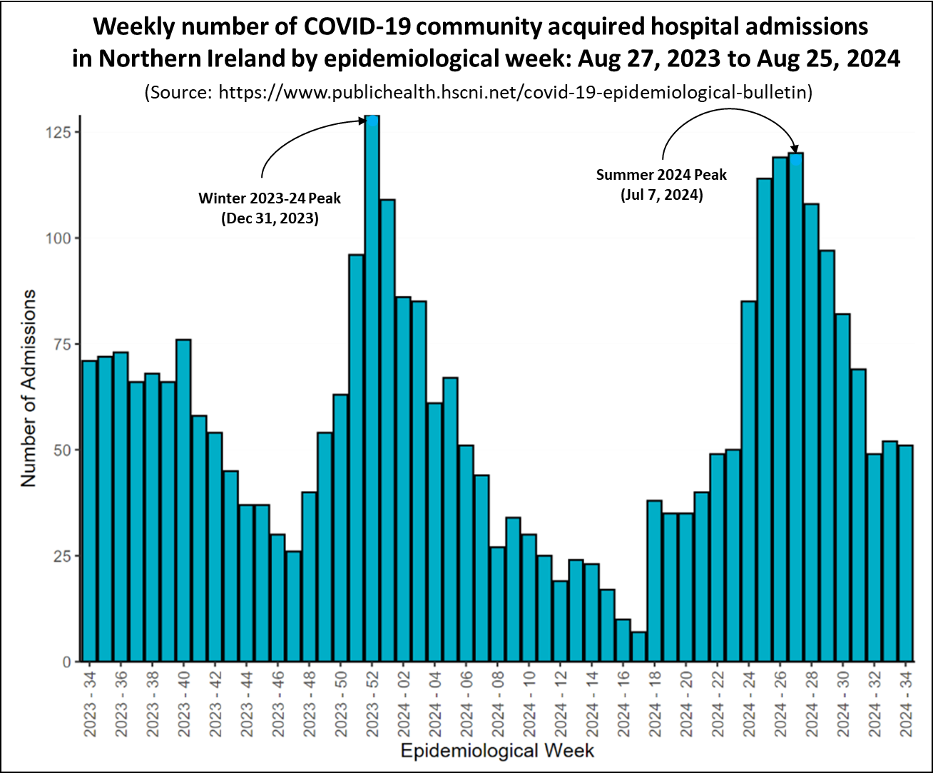
The chart shows a similar pattern to that seen in Scotland Wales, with the 'summer' wave's peak nearly reaching the heights of the 'winter' wave. However, since then the number of admissions has fallen and has now stabilised indicating that this 'summer' wave over.
Regional inequalities in Long Covid prevalence.
Last week, Health Equality North published a report called Navigating the Long Haul: Understanding Long Covid in Northern England. The report examines regional differences in rates of Long Covid, the relationship with socioeconomic deprivation, the impact of the illness on sufferers lives and how employers manage the condition. It uses data from the 2022 annual General Practice Patient Survey (GPPS) of just over two million patients registered at each general practice in England. In addition, patient interviews were carried out to capture the lived experience of Long Covid sufferers. The report can be accessed
here.
Analysis of the GPPS showed that national prevalence of people reporting having symptoms of Long Covid for more than 12 weeks in 2022 in England was 4.4%. The following chart shows the self-reported Long Covid prevalence by region.
The chart indicates significant regional disparities in prevalence. The highest rates were observed in the North West at 5.5% and the North East and Yorkshire at 5.1%. Conversely, the lowest rates were recorded in the South West at 3.4% and the South East at 3.6%.
Significantly, the ten general practices reporting the highest rates of Long Covid were all located in the Northern regions. In the North East and Yorkshire, as well as the North West, there were some practices where at least 20% of patients were affected by Long Covid.
Further analysis of the GPPS survey found significant inequalities in Long Covid prevalence based on deprivation as shown in the following chart.
The chart indicates that in England, the prevalence rate in the most deprived decile is 6.3%, which is almost double the rate in the least deprived decile at 3.3%. The report highlighted significant evidence of socioeconomic disparities in Long Covid prevalence within the North East and Yorkshire. Specifically, the incidence in the most deprived group was 8.3%, which is 5.2 percentage points greater than the 3.1% observed in the least deprived areas.
In addition to the quantitative data, Health Equality North carried out a series of interviews and workshops to explore people’s experiences of living with Long Covid in North East England. The report indicated that Long Covid includes a range of physical, cognitive, and psychological impairments, with the most frequently reported symptoms being brain fog, fatigue, breathlessness, low mood, and depression.
The severe impact of these symptoms significantly hampered participants’ lives, impeding their capacity to work and carry out routine activities. In particular, Long Covid sufferers experienced a degree of social isolation, which was exacerbated by a lack of effective communication with non-ill individuals. Long Covid also had a significant impact on working life and employment prospects. Many participants had been demoted, fired, forced to resign or switch to part-time work because of Long Covid.
The report closes with a recommendation for Government to:
- Develop programmes for employers to support members of their workforce with Long Covid, and
- Consult with Long Covid patients to better understand their condition and to implement care plans to facilitate their rehabilitation and improve management of the condition.
In conclusion
Although the amount of data currently being published has decreased, the information available for England show that Covid levels are now falling and the summer wave is over.
Data from Scotland, Wales, and Northern Ireland indicate that the recent 'summer' wave of Covid saw higher levels than the 'winter' wave. Nevertheless, the latest figures show that Covid levels are continuing to fall and this recent surge has ended.
As always, if you have any comments on this Covid Situation Report or suggestions for topics to cover, please post a message below.
Subscribe
Appendix 1. Test positivity rates and prevalence
Positivity rates are derived from the results of hospital laboratory tests conducted on patients exhibiting symptoms of respiratory diseases. Test positivity is the percentage of patients who test positive for Covid of the total number of patients tested. Since the individuals tested for this measure are not a representative sample of the general population it differs from prevalence, which is derived from a representative sample of the population.
Test positivity rates, while not directly estimating the number of Covid infections in the general population, can be a valuable indicator of the infection trend. The panel chart below compares the weekly test positivity rate among hospital patients with respiratory symptoms to the prevalence of Covid in the general population, as reported in the Winter Infection Survey.
The chart shows that the weekly test positivity rates for patients with symptoms of respiratory infections follows the same pattern as the prevalence for Covid reported by the Winter Infection Survey. Since the Winter Infection Survey is based on a representative sample of the general population this supports using test positivity as a useful proxy for infection trends.
Appendix 2. How reliable are Daily Covid Case Rates?
The UKHSA Covid dashboard continues to publish daily case rates for England on a weekly basis. As the majority of testing now occurs in hospitals or under medical supervision, these rates should be closely aligned with hospital admissions and the positivity rate of tests.
The first panel chart in this section tests that assumption by comparing the daily case rate per 100,000 individuals, shown in red, with daily hospital admissions for Covid reported by NHS England, depicted in blue.
The chart shows that while Covid case rates generally mirror the pattern of Covid hospital admissions, there is a significant disparity in the scale of changes. The grey shaded areas on each chart highlights the difference between the peak of the winter wave and the recent peak in June. Case rates experienced a 64% decrease, whereas hospital admissions saw a reduction of only 32% between the winter and June peaks.
In conclusion, although case rates are useful for indicating the overall trend of Covid in the population, they do not accurately reflect the extent of change. The likely reason for this is that testing levels have decreased by about a half since January.


 www.statnews.com


")
")
")