Navigation
Install the app
How to install the app on iOS
Follow along with the video below to see how to install our site as a web app on your home screen.
Note: This feature may not be available in some browsers.
More options
Style variation
You are using an out of date browser. It may not display this or other websites correctly.
You should upgrade or use an alternative browser.
You should upgrade or use an alternative browser.
Covid-19 News and Discussions
- Thread starter Yommie
- Start date
Yommie
SpeedLimited
- Oct 2, 2013
- 64,183
- 37,189
- Country of Origin

- Country of Residence

- Thread starter
- #1,397
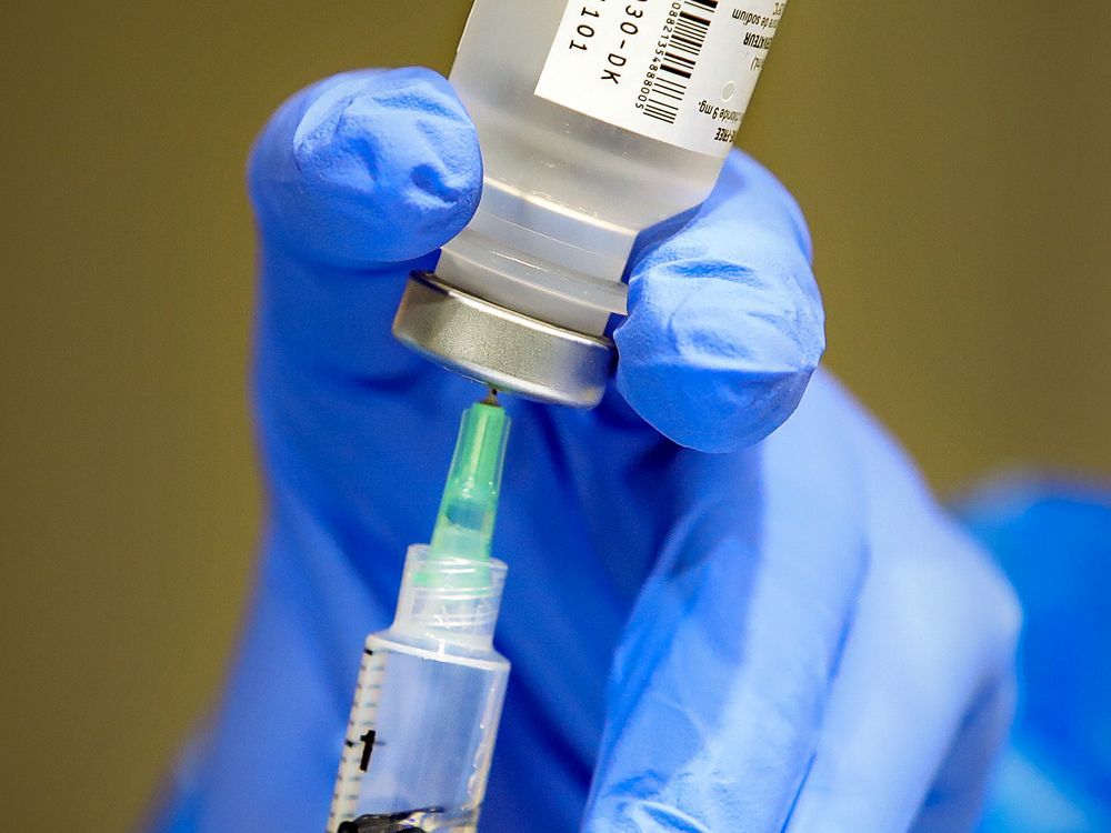
Vulnerable Quebecers told to get COVID-19 vaccine this fall
The immunization committee's recommendations come as the province experiences a wave of summer cases and hospitalizations.
 montrealgazette.com
Vulnerable Quebecers told to get COVID-19 vaccine this fall
The immunization committee's recommendations come as the province experiences a wave of summer cases and hospitalizations.Author of the article:
Montreal Gazette
Published Jul 23, 2024 • 3 minute read
Join the conversation

Article content
Quebec’s immunization committee is once again recommending that certain vulnerable groups get vaccinated against COVID-19 this fall.The recommendations, published Monday for Quebec’s Health Ministry as well as health-care institutions, come as the province experiences a summer wave of COVID-19 cases and hospitalizations.
The committee recommends boosters for the same groups as it did last year:
- Those living in CHSLDs, RPAs and other communal environments for elderly or vulnerable people
- People 60 and older
- Those who are immunocompromised, on dialysis or living with a chronic illness
- Pregnant women
- Health-care workers
- Adults living in remote or isolated areas, if advised by local public health authorities or community leaders
“For other groups, such as healthy young adults, one dose could be offered,” the recommendations read. “However, the (immunization committee) considers that the benefits of such a dose will be minor, given the very low risk of complications from COVID-19 in this population.”
It noted that hospitalizations related to COVID-19 are most common among elderly people and those with chronic illnesses.
The province’s positivity rate for COVID-19 tests stands at 16.3 per cent, up from a low of 2.1 per cent in early April, according to the Institut national de santé publique du Québec. During the week of July 14, the latest week for which data is available, 790 Quebecers tested positive for the virus. Quebec also reported a total of 820 hospitalizations with and for COVID-19 as of July 16, up from a low of 428 such hospitalizations in April.
Today's One Read
Get the most interesting story of the day.
Sign Up
By signing up you consent to receive the above newsletter from Postmedia Network Inc.
Article content
Advertisement 3
STORY CONTINUES BELOW
Article content
The uptick is being driven largely by the KP.3 sub-variant, which is now predominant in Quebec.
For the fall campaign, the immunization committee is recommending Quebec wait for a vaccine adapted to the strains in circulation. It also says the province should not recommend mRNA vaccines over the protein-based Nuvaxovid vaccine, saying both could be offered based on whichever is best suited to variants in circulation at the time.
The committee pointed out that vaccines targeting the XBB.1.5 variant are the most up-to-date, but noted that one targeted to circulating strains should be authorized in time for the fall campaign.
Novavax said earlier this month that it is developing a vaccine that would protect against KP.3 in Canada in time for the fall.
The committee added that primary analyses show the XBB.1.5 vaccine — given out during the fall 2023 campaign for those over 60 — resulted in that group being 43 per cent more protected compared to those who only received a booster of the monovalent or bivalent vaccine during the fall 2022 campaign.
It suggested an interval of six months from the last dose of COVID-19 vaccine or a confirmed infection, with a minimum interval of three months.
“This flexibility aims to facilitate vaccination in fall 2024 and allow a targeted person to receive a dose during this campaign even if they were vaccinated late during the previous campaign,” the recommendations read. “It is not intended to allow the offering of a dose of vaccine every three months. A targeted person should receive no more than two booster doses in a 12-month period.”
The committee also suggested that Quebec offer COVID-19 boosters at the same time as flu vaccines.
It added that recommendations for the fall will be revised if necessary ahead of time or during the campaign as the COVID-19 situation continues to evolve.
Yommie
SpeedLimited
- Oct 2, 2013
- 64,183
- 37,189
- Country of Origin
- Country of Residence
- Thread starter
- #1,398
France sees no Olympic spike in Covid cases: minister

IOC members watch a video promoting France’s bid to host the 2030 Winter Games at the 2024 Summer Olympics, Wednesday, July 24, 2024, in Paris, France. (AP)
Short Url
Updated 10 sec ago
AFP
July 25, 202407:24
96
Follow
- A few of the 10,500 athletes set to patricipate have tested positive for Covid since arriving
“Covid is still with us at a low level” but “we’re not in a period with an explosion or strong return” of the virus, junior health minister Frederic Valletoux told broadcaster Franceinfo.
He added that authorities were not “for now” expecting to introduce mask requirements in venues.
“There’s no kind of very strong alert signal at this stage,” Valletoux said.
A few of the 10,500 athletes set to patricipate have tested positive for Covid since arriving.
“We knew there is no such thing as zero risk,” Valletoux said.
Among the worst hit are Australia’s female water polo team, with the delegation’s head Anna Meares confirming five cases, while several Belgian competitors have also tested positive according to Olympic Committee doctors.
Some delegations have toughened up precautions in response.
For instance, France’s rowing team insisted on masks at media events ahead of the competition.
Yommie
SpeedLimited
- Oct 2, 2013
- 64,183
- 37,189
- Country of Origin
- Country of Residence
- Thread starter
- #1,399

Why is COVID surging this summer? A doctor explains what to know and how to stay safe.
COVID is spiking across the country, but why? CBS News medical contributor Dr. Céline Gounder explains why July is seeing increased cases.
Why is COVID surging this summer? A doctor explains what to know and how to stay safe.
By Sara Moniuszko
Edited By Allison Elyse Gualtieri
July 24, 2024 / 3:13 PM EDT / CBS News
It's not just President Biden who recently tested positive for COVID — cases of the virus are spiking across the country.
Nearly 40 states are reporting high COVID activity levels, according to data from the Centers for Disease Control and Prevention, and emergency room visits are at their highest for the virus since February.
Why the seemingly sudden summer surge? There are a couple of factors at play, Dr. Céline Gounder, CBS News medical contributor and editor-at-large for public health at KFF Health News, told "CBS Mornings" Wednesday.
"One, the virus continues to evolve to stay ahead of our immune systems. That's what we can talk about when we're talking about variants," she said. "Two, your immunity to infection only lasts about three months. Your immunity to severe disease, hospitalization and death, that lasts much longer, which is why people are not getting sick the way they were early in the pandemic. But it is to be expected that every few months, maybe twice a year or so, we'll see a big wave of COVID across the country."
More reasons for increased numbers? People are traveling and spending more time indoors and not masking as much, Gounder added.
These reasons add to the concerning potential for a COVID-19 outbreak to spread within the tightly confined 2024 Summer Olympics, as thousands of athletes and spectators from around the world have descended on Paris.
Current guidelines, however, can help keep people safe.
"You should be staying away from others for at least 24 hours, at least until your fever resolves without the help of a medication like Tylenol, and your symptoms are improving," Gounder said. But you should, as much as possible, take additional measures "for at least five more days, which is when you're most infectious, most likely to transmit to other people."
Options for this include:
- Continuing to isolate
- Wearing a mask when you're around other people
- Opening windows
- Using HEPA air filtration units to reduce the risk of transmission
"If you're feeling sick, probably should get tested. When you're feeling sick, probably shouldn't be around other people to the degree that you can avoid that," she said. And masks, "contrary to some opinions, do work to protect you if you're wearing a N95 or KN95 mask, and they also work to protect other people if you're infected."
Yommie
SpeedLimited
- Oct 2, 2013
- 64,183
- 37,189
- Country of Origin
- Country of Residence
- Thread starter
- #1,400

Study reveals moderate burden of post-COVID conditions in primary care
The post-COVID-19 conditions (PCC) or long COVID prevalence among United States (US) adults infected with SARS-CoV-2.
 www.news-medical.net
Study reveals moderate burden of post-COVID conditions in primary care

In a recent study published in the Annals of Family Medicine, researchers estimated the post-coronavirus disease 2019 (COVID-19) conditions (PCC) or long COVID prevalence among United States (US) adults infected with severe acute respiratory syndrome coronavirus 2 (SARS-CoV-2).
Study: Post-COVID Conditions in US Primary Care: A PRIME Registry Comparison of Patients With COVID-19, Influenza-Like Illness, and Wellness Visits. Image Credit: Photoroyalty/Shutterstock.comBackground
COVID-19 considerably influences United States health, resulting in chronic illnesses typically detected in primary care settings.The secondary COVID-19 wave of chronic symptoms may increase the COVID-19 burden on US residents. While severe COVID-19 disease and hospital admission may raise the likelihood of PCC, people with mild-moderate SARS-CoV-2 infection may also experience chronic symptoms.
Existing research on PCC symptoms is expanding; however, there are constraints, especially concerning healthcare delivery in the US. Issues include low generalizability owing to patient identification criteria, a lack of variety in patient features, inadequate follow-up time, and unpredictability in outcome measurements.
Existing studies are prospective and estimate the prevalence rates of preselected symptoms, which may not require general population healthcare or a diagnosis due to low severity.
About the study
In the present study, researchers evaluated the PCC burden and determined the cumulative morbidity rate for COVID-19 patients pre- and post-infection in primary care settings.The researchers analyzed the American Family Cohort (AFC) national primary care registry data to identify study patients between January 2017 and March 2022, including 3.90 million US residents having 32 million healthcare visits.
Eligible participants visited primary care practices at least once in 12 or more months before COVID-19 and one or more visits two weeks to one year before diagnosis, excluding those who turned inactive within three months of their diagnosis.
Industry Focus: Infectious Diseases eBook Compilation of the top interviews, articles, and news in the last year.Download the latest edition
The researchers performed propensity score matching to assess the individual and cumulative prevalence of 17 PCC categories.
They compared individuals infected with SARS-CoV-2 in 2020-2021 with (i) historical control individuals having influenza-like illness (ILI) in 2018 and (ii) contemporaneous controls seen for preventive or wellness visits in 2020-2021.
The researchers identified COVID-19 patients using the International Classification of Diseases, tenth revision, and clinical modification (ICD-10-CM) codes, diagnosed between April 2020 and October 2021. Historical controls were diagnosed with ILI between January and December 2018 using the Systematized Nomenclature of Medicine (SNOMED), ICD-9-CM, and ICD-10-CM codes.
The team identified contemporaneous controls for 2020 (between April and December) and 2021 (between January and October) using current procedural terminology (CPT) codes.
The researchers used multivariable logistic regressions for analysis, controlling for age, gender, race, ethnicity, socioeconomic deprivation, pre-diagnosis or pre-inclusion healthcare use, and pre-diagnosis or pre-inclusion morbidity in the diagnostic categories, month, and year of diagnosis or inclusion.
They performed secondary analyses, restricting the sample population to ILI and COVID-19 patients visiting primary care clinics at least once, three or more months after diagnosis.
Results
The researchers identified 28,215 individuals infected with SARS-CoV-2 and 235,953 ILI patients. COVID-19 patients had higher prevalences of diabetes mellitus type 2 (12% versus 10%), breathing difficulties (4.2% versus 1.9%), sleep disturbances (3.5% versus 2.4%), and fatigue (3.9% versus 2.2%).However, the team found no differences in the postdiagnosis monthly trend in cumulative morbidity between ILI and COVID-19 patients. Relative to contemporaneous wellness controls, COVID-19 patients had higher prevalence rates for type 2 diabetes and breathing difficulties.
The secondary analysis revealed that COVID-19 and ILI patients had similar cumulative morbidity at diagnosis, but there was a higher divergence after six months. The average number of problems grew from 0.5 at diagnosis to 0.7 after six months, while ILI patients had a reduction from 0.5 to 0.6.
COVID-19 patients exhibited higher monthly increases in cumulative morbidity, whereas ILI patients had a 0.006 lower rise.
The study showed that COVID-19 patients and wellness controls had comparable rates of different diagnoses. In 2020, patients had a greater morbidity rate for respiratory issues and type 2 diabetes mellitus than controls. In 2021, patients had higher rates of these disorders.
Conclusion
The study found a modest prevalence of post-COVID symptoms in primary care practices, such as exhaustion, sleep disruptions, and breathing difficulties. These situations are less severe than those encountered in hospitals and specialist settings.The study underlines the significance of ongoing PCC monitoring to assess their epidemiology, morbidity, and longevity.
The team detected PCC symptoms in 12% of individuals following SARS-CoV-2 infection, with prevalence below 12% for 17 diagnostic categories at six months. Future studies should investigate PCC in various patient situations, considering changes in clinical care capability.
Yommie
SpeedLimited
- Oct 2, 2013
- 64,183
- 37,189
- Country of Origin
- Country of Residence
- Thread starter
- #1,401

As provincial funding ends, Ottawa's wastewater surveillance will continue for now
Provincial funding ends July 31, but the University of Ottawa has secured funding to continue the program "as-is for the coming months.”
 ottawacitizen.com
As provincial funding ends, Ottawa's wastewater surveillance will continue for now
The globally recognized program tests wastewater for influenza, RSV and other diseases in addition to the virus that causes COVID-19.Get the latest from Elizabeth Payne straight to your inboxSign Up
Author of the article:
Elizabeth Payne
Published Jul 24, 2024 • Last updated 9 hours ago • 2 minute read
13 Comments

Article content
Ottawa’s wastewater surveillance program will continue after the Ontario government ends funding on July 31, a memo from Board of Health chair Catherine Kitts says.In a memo sent to Mayor Mark Sutcliffe and council members Wednesday, Kitts said the surveillance initiative, operated and managed under Robert Delatolla’s team at the University of Ottawa, will remain as it is while discussions about longer-term solutions continue.
The province announced earlier this year that it would stop funding for the highly regarded program as of the end of July — at a savings of around $15 million.
Provincial officials said then that the federal government was expanding its own wastewater surveillance initiative and they wanted to avoid overlap. The federal government currently has four wastewater surveillance sites in the Toronto area and has said it wants to add four or five more. Ontario’s program, one of the world’s most extensive, gathers information at more than 50 locations.
In the memo, Kitts said the city “has been assured that, although provincial funding sunsets on July 31, the University of Ottawa has secured funding to continue this program as-is for the coming months.”
Meanwhile, she said, Ottawa Public Health Medical Officer of Health Dr. Vera Etches had sent letters to federal and provincial public health officials “seeking to collaborate to ensure the uninterrupted continuation of high-quality wastewater surveillance in Ottawa.”
Ottawa Public Health has also been working with uOttawa and “numerous local and provincial partners to explore ways to ensure continuation of this program,” the memo said.
Advertisement 3
STORY CONTINUES BELOW
Article content
Longer-term solutions are still being explored.
Kitts noted there had been no further details from the Public Health Agency of Canada about plans to expand its program. Wastewater testing, she said, has been an important public health tool.
“Local wastewater testing for infectious diseases has proven to be a valid, near real-time and reliable method of unbiased public health surveillance and a leading indicator of community transmission, and is an important tool for local public health units, including Ottawa Public Health, and numerous local health partners,” she said.
Information from wastewater surveillance has helped keep Ottawa residents informed and allows Ottawa Public Health and health-care partners to implement early public health interventions, including additional infection prevention and control measures, RSV prophylaxis for high-risk infants at CHEO and promotion of vaccination to higher-risk populations, she said.
The end of provincial funding for the globally recognized program that tests wastewater for influenza, RSV and other diseases, in addition to the virus that causes COVID-19, comes at a time when cases of COVID are spiking in Ottawa and elsewhere in Ontario as a new, highly contagious variant spreads.
Yommie
SpeedLimited
- Oct 2, 2013
- 64,183
- 37,189
- Country of Origin
- Country of Residence
- Thread starter
- #1,403

Covid Situation Report: Jul 18, 2024
Update on Covid providing information on prevalence and hospital admissions for England and its regions. This post is best viewed using the browser or Substack app.
 bhawkins3.substack.com
Covid Situation Report: Jul 18, 2024
Update on Covid providing information on prevalence and hospital admissions for England and its regions. This post is best viewed using the browser or Substack app.

BOB HAWKINS
JUL 18, 2024
25
4
Share
Introduction.
This report is part of a weekly series that summarises the Covid situation in England and its regions.A reminder that not all of the data previously included in the situation update is now available on a weekly basis. Where relevant, changes to the content and data sources have been noted.
This week's report contains data on weekly Covid hospital admissions from the UKHSA surveillance report, which is now released biweekly. Additionally, it includes case rates from the UKHSA Covid dashboard. The report also provides an update on deaths due to Covid in England and Wales.
Summary.
While last week's data suggested that Covid levels had likely peaked, this week's figures indicate a resurgence, with rises in test positivity, weekly hospital admissions, and case rates.In the past two weeks, the positivity rate for Covid has once more started to increase following a slight fall. Positivity rates remain highest in the older age groups.
In the past four weeks, weekly hospital admission rates for Covid have stabilised but at levels approaching the Winter 2023 peak.
The recent increase in daily case rates has continued across all regions, with the North East experiencing the most significant rise.
While this year's deaths due to Covid are significantly lower, the recent rise in Covid levels has led to a rise in deaths due to Covid.
It now seems likely that this summer wave is continuing, indicating that Covid is not yet a seasonal disease and we are likely to experience further waves as new variants emerge and immunity levels wane.
As always, it’s important to remember that the risk of hospitalisation from Covid infection increases significantly with age and for those immunocompromised. Also Long Covid remains a risk for all as shown by the recent ONS report. Therefore, it is prudent to take appropriate measures such as self-isolating when experiencing Covid symptoms and enhancing ventilation or wearing masks whenever possible.
For those who are interested, I recently published an article covering the ONS data on Long Covid in more detail which can be found here. Also a comprehensive review of the evidence in support of wearing masks is available here.
Status of main respiratory diseases in England.
This section starts with the latest available data on positivity rates for primary respiratory infections in England. It is important to understand that positivity differs from prevalence, which refers to the overall percentage of COVID-19 in the general population. Appendix 1 provides a more detailed explanation of the difference and why positivity rates are a useful indicator of trends in Covid infection levelsThe chart below displays the test positivity rates for the main respiratory illnesses in England, including Flu, Covid, RSV, and Rhinovirus.
Over the past two weeks, the Covid positivity rate has again increased slightly and has reached its highest level for 18 months at 13.2% for week ending Jul 14 confirming the resurgence of Covid levels in the general population. This is an important reminder that Covid is not yet a seasonal illness and we are likely to experience further waves as new variants emerge and immunity levels wane.
Meanwhile, the flu positivity rate has continued to fall and remains significantly lower than that of Covid. Additionally, RSV rates have dropped to very low levels, accompanied by a fall in Rhinovirus rates.
The next chart shows the trend for Covid positivity rate by age. Hover your cursor over one of the chart lines to display the positivity rate for all ages. For comparison the grey line shows the positivity rate for all age groups.
The chart clearly indicates that test positivity rates are highest among individuals aged 65 and older although there has been a notable increase in the very youngest age group in the past two weeks. It is important to note that the majority of tests are now conducted on hospital patients, who are disproportionately older since they are more likely to be hospitalised due to Covid.
The final chart in this section shows weekly hospital admissions per 100,000 people in England for the main respiratory diseases.
Consistent with the test positivity rate data, the past two weeks have seen weekly hospital admission rates for Covid increased slightly, and are now approaching the levels seen during the winter wave of infections. Note that hospital admission data for Flu and RSV is no longer published.
Although age-specific data for hospital admissions are no longer released, earlier statistics on Covid hospital admissions and the current test positivity rates by age indicate that the rise in hospitalizations will primarily impact the over 65 year olds.
It's important to note that while testing policies have been updated from April 1, 2024, the guidelines for testing patients showing Covid symptoms or when a positive result would change the patient's treatment remained unchanged. Consequently, the number of Covid hospital admissions should be a dependable indicator of the virus's prevalence in the community for the period shown in these charts.
Covid hospital admissions and bed occupancy.
This section gives a more detailed examination of the most recent daily Covid data for hospitals in England.NHS England stopped the weekly publication of data used to create these dashboards from April 4, 2024 and have moved to a monthly publication schedule. The next update will be on August 8, 2024 covering July Covid hospital admissions and bed occupancy.
Covid case rates
The UKHSA Covid dashboard continues to publish daily case rates on a weekly basis. As the majority of testing now occurs in hospitals or under medical supervision, these rates should closely align with hospital admissions. However, a comparison of daily case rates and daily admissions shows that this is not the case.Appendix 2 indicates that although Covid case rates typically reflect the pattern of hospital admissions, there is a notable discrepancy in the magnitude of changes, with admissions experiencing a more pronounced fluctuation than case rates. Therefore, while case rates are helpful in signalling the general trend of Covid within the population, they do not precisely represent the degree of change.
The first chart in this section shows daily case rate per 100,000 individuals.
The chart indicates that the rise in Covid case rates has persisted and continues to be at levels higher than the May peak. However, for the reasons outlined above an in Appendix 2 it is not advisable to compare with the Winter 2023 peak.
The next panel chart in this section shows Covid rates for the regions of England. Hover your cursor over one of the chart lines to display the admission rates for all regions.
The panel charts show that the recent surge in case rates across all regions has continues with the the North East region seeing the sharpest rise.
Covid Deaths in England and Wales
The Office of National Statistics (ONS) publishes weekly reports on the number of deaths recorded on death certificates that are due to Covid or where Covid was involved. The data available is for both England and Wales.The following chart shows a comparison of weekly registered deaths due to Covid in England and Wales for 2023-24, represented in brown, against the previous year, illustrated in blue. The light green shaded area indicates weeks when deaths in 2022-23 were lower than this year, while the light red shaded area denotes weeks when deaths were higher this year. It excludes deaths where Covid was mentioned as a contributing factor on the death certificate.
In the week ending July 5, 2024, there were 114 deaths due to Covid in England and Wales (1.1% of all deaths reported), with an additional 171 deaths where Covid was noted as a contributing factor. This marks the second consecutive week where Covid-related deaths have surpassed those of the corresponding weeks in 2023. Despite this recent uptick, the weekly death toll for 2023/24 has been considerably lower than the previous year. Over the 12 months leading up to July 5, 2024, there were 7,104 deaths due to Covid, compared to 15,796 in the preceding 12 months.
In conclusion
Despite the reduced level of data now published, the available information indicates that the summer wave in Covid levels has not yet peaked.Deaths due to Covid are much lower this year although there has been a slight increase in the past month and levels are above those in July 2023.
As always, if you have any comments on this Covid Situation Report or suggestions for topics to cover, please post a message below.
Subscribe
Appendix 1. Test positivity rates and prevalence
Positivity rates are derived from the results of hospital laboratory tests conducted on patients exhibiting symptoms of respiratory diseases. Test positivity is the percentage of patients who test positive for Covid of the total number of patients tested. Since the individuals tested for this measure are not a representative sample of the general population it differs from prevalence, which is derived from a representative sample of the population.Test positivity rates, while not directly estimating the number of Covid infections in the general population, can be a valuable indicator of the infection trend. The panel chart below compares the weekly test positivity rate among hospital patients with respiratory symptoms to the prevalence of Covid in the general population, as reported in the Winter Infection Survey.
The chart shows that the weekly test positivity rates for patients with symptoms of respiratory infections follows the same pattern as the prevalence for Covid reported by the Winter Infection Survey. Since the Winter Infection Survey is based on a representative sample of the general population this supports using test positivity as a useful proxy for infection trends.
Appendix 2. How reliable are Daily Covid Case Rates?
The UKHSA Covid dashboard continues to publish daily case rates on a weekly basis. As the majority of testing now occurs in hospitals or under medical supervision, these rates should be closely aligned with hospital admissions and the positivity rate of tests.The first panel chart in this section tests that assumption by comparing the daily case rate per 100,000 individuals, shown in red, with daily hospital admissions for Covid reported by NHS England, depicted in blue.
The chart shows that while Covid case rates generally mirror the pattern of Covid hospital admissions, there is a significant disparity in the scale of changes. The grey shaded areas on each chart highlights the difference between the peak of the winter wave and the recent peak in June. Case rates experienced a 64% decrease, whereas hospital admissions saw a reduction of only 32% between the winter and June peaks.
In conclusion, although case rates are useful for indicating the overall trend of Covid in the population, they do not accurately reflect the extent of change. The likely reason for this is that testing levels have decreased by about a half since January.
Yommie
SpeedLimited
- Oct 2, 2013
- 64,183
- 37,189
- Country of Origin
- Country of Residence
- Thread starter
- #1,404

Covid Situation Report: Jul 25, 2024
Update on Covid providing information on prevalence and hospital admissions for England and its regions. This post is best viewed using the browser or Substack app.
bhawkins3.substack.com
Covid Situation Report: Jul 25, 2024
Update on Covid providing information on prevalence and hospital admissions for England and its regions. This post is best viewed using the browser or Substack app.
BOB HAWKINS
JUL 25, 2024
5
1
Share
Introduction.
This report is part of a weekly series that summarises the Covid situation in England and its regions.A reminder that not all of the data previously included in the situation update is now available on a weekly basis. Where relevant, changes to the content and data sources have been noted.
This week the only data published for England are case rates from the UKHSA Covid dashboard. As data for England is limited, I have included the latest available data for Scotland and Wales.
Summary.
The limited data available this week for England indicates that Covid levels continue to rise but at a slower rate,In the past week, case rates for England increased slightly but are showing signs of peaking. Case rates across the region show a mixed picture with indications of a slowdown in the south of England. Conversely, there are signs of a resurgence in the northern regions.
In Scotland, hospital admissions and the number of beds occupied by Covid patients have likely peaked but at a higher level than seen over Winter 2023/24. However, Covid levels in wastewater have seen a resurgence in the latest few days.
In Wales, the number of Covid cases has likely peaked although a levels higher than those seen over Winter 2023/24. Hospital admissions have also stopped rising.
Although this wave is most likely over, this is an important reminder that Covid is not yet a seasonal disease, and we are likely to experience further waves as new variants emerge and immunity levels wane.
As always, it’s important to remember that the risk of hospitalisation from Covid infection increases significantly with age and for those immunocompromised. Also Long Covid remains a risk for all as shown by the recent ONS report. Therefore, it is prudent to take appropriate measures such as self-isolating when experiencing Covid symptoms and enhancing ventilation or wearing masks whenever possible.
For those who are interested, I recently published an article covering the ONS data on Long Covid in more detail which can be found here. Also a comprehensive review of the evidence in support of wearing masks is available here.
Status of main respiratory diseases in England.
The UKHSA National influenza and COVID-19 surveillance report has moved to a condensed summer report and is now released every two weeks. Consequently, there is no updated information on Covid test positivity or weekly hospital admissions available to report. The next update will be published on Thursday, August 1.
Covid hospital admissions and bed occupancy in England.
This section gives a more detailed examination of the most recent daily Covid data for hospitals in England.NHS England stopped the weekly publication of data used to create these dashboards from April 4, 2024 and have moved to a monthly publication schedule. The next update will be on August 8, 2024 covering July Covid hospital admissions and bed occupancy.
Covid case rates in England
The UKHSA Covid dashboard continues to publish daily case rates for England on a weekly basis. As the majority of testing now occurs in hospitals or under medical supervision, these rates should closely align with hospital admissions. However, a comparison of daily case rates and daily admissions shows that this is not the case.Appendix 1 indicates that although Covid case rates typically reflect the pattern of hospital admissions, there is a notable discrepancy in the magnitude of changes, with admissions experiencing a more pronounced fluctuation than case rates. Therefore, while case rates are helpful in signalling the general trend of Covid within the population, they do not precisely represent the degree of change.
The first chart in this section shows daily case rate per 100,000 individuals.
The chart indicates that the rise in Covid case rates has slowed and is likely reaching a plateau. Nonetheless, current case rates remain higher than those observed during the peak in May. It is important to note, as detailed above and in Appendix 1, that comparisons with the peak in Winter 2023 are not recommended.
The next panel chart in this section shows Covid rates for the regions of England. Hover your cursor over one of the chart lines to display the admission rates for all regions.
The panel charts show that the recent increase in case rates has persisted across many regions, although there are indications of a slowdown in the south of England. Conversely, there are signs of a resurgence in the northern regions. The North East region continues to report a case rate significantly higher than any other area.
Scotland weekly hospital admissions and bed occupancy
Scotland continues to publish weekly data on hospital admissions and bed occupancy for Covid as well as waste water monitoring data.The following panel chart shows the most recent data for weekly Covid hospital admissions up to Jul 14, depicted in blue, together with the number of beds occupied by Covid patients up to Jul 21, shown in orange. The number of occupied beds represent patients being treated for Covid as well as those being treated with Covid.
The charts shows that the recent 'summer' Covid wave in Scotland has led to more hospital admissions and a greater number of beds occupied by Covid patients compared to the 'winter' wave. This contrasts with England, where 'summer' hospital admissions did not surpass those seen in 'winter'.
Although the most recent data suggest that the recent surge in admissions in Scotland may have reached its peak, it is still premature to conclude that Covid levels are declining.
Scotland is now the only home nation that is monitoring Covid levels using wastewater sampling and the following chart shows the latest levels reported.
The data indicates that the Covid levels in wastewater detected during the recent 'summer' wave were higher than those observed in the 'winter' wave. This is consistent with the trend seen in the hospital data. Worryingly, the latest wastewater data indicates a resurgence of Covid.
Interestingly, the very high wastewater levels seen in summer 2023 did not correlate with very high hospital admissions. It’s difficult to say why this was the case but could be due to wastewater testing being less sensitive for the most recent variants.
Wales Covid cases and hospital admissions.
Public Health Wales publishes a weekly Covid dashboard, presenting key Covid hospital indicators for the preceding 90 days. This dashboard can be found here. Additionally, data regarding Covid cases detected through testing in hospitals and other medical facilities are released every two weeks.The following charts shows the latest data for the weekly (7 day rolling sum) number of cases reported.
The chart shows that the recent surge in cases surpassed the 'winter' wave, reaching a peak that was the highest in over a year. There are early signs that cases have peaked and are now starting to fall.
Data regarding Covid hospital admissions in Wales is published for the most recent 90-day period, and the following chart gives the current trend.
Hospital admissions for Covid have consistently increased since the end of April 2024, but have now stabilised, mirroring the trend observed in Covid cases.
In conclusion
Although the amount of data currently being published has decreased, the limited information available for England suggests that the recent rise in Covid levels is stabilising albeit at levels higher than seen in May.Evidence from Scotland and Wales indicate that Covid levels in the recent ‘summer’ wave were higher in those seen over ‘winter’. However, the latest data also suggests that the recent surge is slowing and may have plateaued.
As always, if you have any comments on this Covid Situation Report or suggestions for topics to cover, please post a message below.
Subscribe
Appendix 1. How reliable are Daily Covid Case Rates?
The UKHSA Covid dashboard continues to publish daily case rates for England on a weekly basis. As the majority of testing now occurs in hospitals or under medical supervision, these rates should be closely aligned with hospital admissions and the positivity rate of tests.The first panel chart in this section tests that assumption by comparing the daily case rate per 100,000 individuals, shown in red, with daily hospital admissions for Covid reported by NHS England, depicted in blue.
The chart shows that while Covid case rates generally mirror the pattern of Covid hospital admissions, there is a significant disparity in the scale of changes. The grey shaded areas on each chart highlights the difference between the peak of the winter wave and the recent peak in June. Case rates experienced a 64% decrease, whereas hospital admissions saw a reduction of only 32% between the winter and June peaks.
In conclusion, although case rates are useful for indicating the overall trend of Covid in the population, they do not accurately reflect the extent of change. The likely reason for this is that testing levels have decreased by about a half since January.
Users who are viewing this thread
Total: 1 (members: 0, guests: 1)
Pakistan Defence Latest
-

-
-
-
-
Bangladesh struggling to muster dollars to pay Indian power debts, sources say (1 Viewer)
- Latest: Fallstuff